Showing posts with label Architecture. Show all posts

Wednesday, July 16, 2014

House Rennovation Project


Who's up for some serious design talk? When you see that header, you'll know it's coming. Haha. I've always hesitated to blog about this area of my life because I thought it quite hard to explain architecture in a less astute, more relatable, and entertaining manner that will interest a lot of people as much as fashion does. But hey, this is after all a design and fashion blog that's an extension of me. So deal with it. :)) Here goes!

*************
They say that when you get your architect's license, your first few clients will be your relatives, and your relatives' relatives. I had an early taste of this during my internship days when our family friend (my godmother) commissioned me to remodel their home. It was a two- storey residence in a subdivision in Punta Princessa, Cebu. Further details to be kept private in keeping with client- architect confidentiality.

It was my first actual design project. During my apprenticeship days, Buddy and I used to work as a full-time intern in an architectural firm on weekdays and made outsourced drawings/ small design works for other architects on weekends. But this, was my first personal design undertaking. It was scary and intimidating at first, but with God's grace I pulled it off with a some help from Bud and of course the support and openness of my trusting clients. :)

The first phase of the project was completed while I was doing reviews for ALE. Yep, this post has been sitting in my drafts more than a year. Haha.


There are a lot of challenges when rennovating a house. There's:

1. Existing structural frame (Beams, Columns)
2. Existing Utility Lines (Water lines, Electrical lines)
3. It was going to be inhabited while construction is ongoing so proper planning and temporary "relocation" should be considered (e.g. where they temporarily cook, where they temporarily watch TV, access, how to keep the house safe and enclosed even whilst demolishing a few walls, etc)

Aside from these, the client wanted to:
1. Create a more contemporary look for their old house
2. Make it more spacious
3. Add an additional bedroom at the ground floor to prepare for old age and mobility issues.
4. Do something about the extreme heat and humidity inside the home esp in the afternoons.
5. Incorporate more natural light into the home to minimize the use of artificial lighting during the 
    day. It had a lot of dark pocket spaces.
6. Convert the husband's office/ shop into a kitchen.
7. Move the water tank
8. Correct the use of perimeter fence as firewall.

And then of course, as in almost all projects.. honest, inevitable design issues like:
1. Budget Constraints
2. Clients' Preference VS Designer's Preference. This is real. 


 Let me give you a quick tour! :)


1.) PORCH.
The house had a huge porch, almost equal to the size of their living room. We divided this porch into half by moving the walls and entrance door forward, and used the second half as a transition foyer to add more space to the interiors instead. We recycled some of their old glass blocks and placed these overhead, chose a more modern and solid door for an opening statement, then placed wall lamps to give the entrance an instant makeover and give it more character. This especially looks charming at night.
 
2.) FOYER.
Instead of completely demolishing the original wall (see upper left photo), we only demolished the upper half of it, preserved the structural column, and topped it with a console table with a wooden top  to serve as a element of transition and visual obsruction from foyer to living room. It will divide the space but by not completely blocking the view, we allow visual continuity to make the space feel bigger. We also added a spotlight for the artwork they will soon mount on the consul table.


3.) KITCHEN AND DINING
At the right side of the original porch was Mr. E's shop/ office (he's a practicing electrical engineer by profession). We converted the space into a kitchen and dining area. Again, to maximize space we moved the walls forward, retained the jailousie window and grills and added a little plant box with topiary plants to make the exterior more welcoming. Plants are my best friends! See the old zoccalo (low wall, like a seat) at the rightmost of the porch?  1/3 of it becomes a full wall for the porch, 2/3 will then belong to the new foyer-- to which we added a glass as a not so solid divider from foyer to kitchen. (See graphics below)

The family's old kitchen was a long and narrow space around 1meter by 6meters wide at the very back portion of the house resting against the perimeter wall was so there was hardly any light, just the little skylights on the roof. (you'll see this later) We made sure that in this new layout, the 3-part-kitchen triangle was complete. Cook--Wash--Store. And that there would be some sun shining through.
We made new cabinet shelves using plywood and MDF cabinet doors, and added some cove lighting under them, and used granite tiles instead of slab to save on cost. ;)
                                              That's the glass partition I was talking about. 
This is the new kitchen and dining, Mr E's old office/ shop. We demolished the wall dividing his office from the living room and made it fully open to make their interior space bigger, and boy did it work wonders. We didn't want any obstruction so the only thing we used to subtly divide the living from the dining was elevation. ;) We raised the living room by one step. Behind the dining, there were existing jalousie windows, we merely lowered the windows to make it longger--inviting more and more day light. We also utilized the same windows for the front of the kitchen.

The soon-to-be replaced dining table. Can't wait to see how the new dining table and mats we spotted will look on their new dining area. :) Thats Mr and Mrs E with Buddy.


4.) LIVING ROOM
Everyone knows that if this was a play, the living room is the main character. It's also one of the most fun to "direct. :) We didn't move the mirror because mirrors are expensive and this one's a huge. So what we did was cover parts of it with plywood and veneer and placed another console table infront of it so they have a space to place jars and other accents. We used a semi-glossy neutral cream-off white color consistent with the whole house to aid the mirror make the space look bigger and reflect light. Dark brown accents and monochromatic hues add drama to the space whilst keeping it clean. For small spaces, its impt to keep furniture to a bare minimum (no fuss couch, table, 2 stools) and keep an organized and clean look through out.


Pillowcases always add a cheap but interesting touch to a living room. They're super easy to play with!
Behind the couch is a big bare wall which we wall with a floral board backdrop. we took this down and made it a clean finish. We'll mount a painting here as soon as the owners find the perfect one. We're relying on this artwork to bring accent colors to the house (Thinking shades of blue reminiscent of the shades of the sea, a little dull green, and some yellow) which we'll later use a basis for additional pillow-cases and other accents for consistency.


5.) BEDROOM
We moved the masters bedroom downstair, to where their old dining area was (behind that mirror) since we already have  new dining space. So we covered it with a wall and then accentuated with an existing piece of furniture. 
Bedroom photos not posted in respect to the privacy of the clients.


6.) POCKET GARDEN
Remember the long strip of kitchen space I told you about above? 
Well, we removed half of its ceiling and turned it into a pocket garden with a full skylight and pergola so they have a space to maybe have coffee in.  It is separated from the interior by a sliding door with a screen so only the screen will be closed in the morning. Its main purpose is to funnel in much needed natural light and air unto the dining and living spaces.


7.) DIRTY KITCHEN
... The other half remains a dirty kitchen, because they need one really bad for "ugly cooking". ;)


The Second floor renovations will be phase 2 of the project.
I would like to thank the couple client for the patience and trust. Seriously, it wasn't an easy transaction but they were alway open to new ideas with just the right amount of skepticism to challenge us. Haha. And they always have snacks for us every time we do site visits. Thanks also to Buddy of Think Factory DS for partnering with me and being my technical arm the whole time.

Also, don't wonder if I don't talk about the water and electrical and structural changes in this post, because I'm quite sure it will bore the hell out of most of my readers. :))
So there! What do you think?
Here's a quick summary of the whole project in photos. It's not perfect, but I'm happy with the turn-out, it was also a great learning curve and a rich experience.
 :)


And just like fashion magazines, here's the cover, I mean the preliminary schemes, that didn't make it:

**SCHEME 1**


ground floor


second floor


**SCHEME 2**
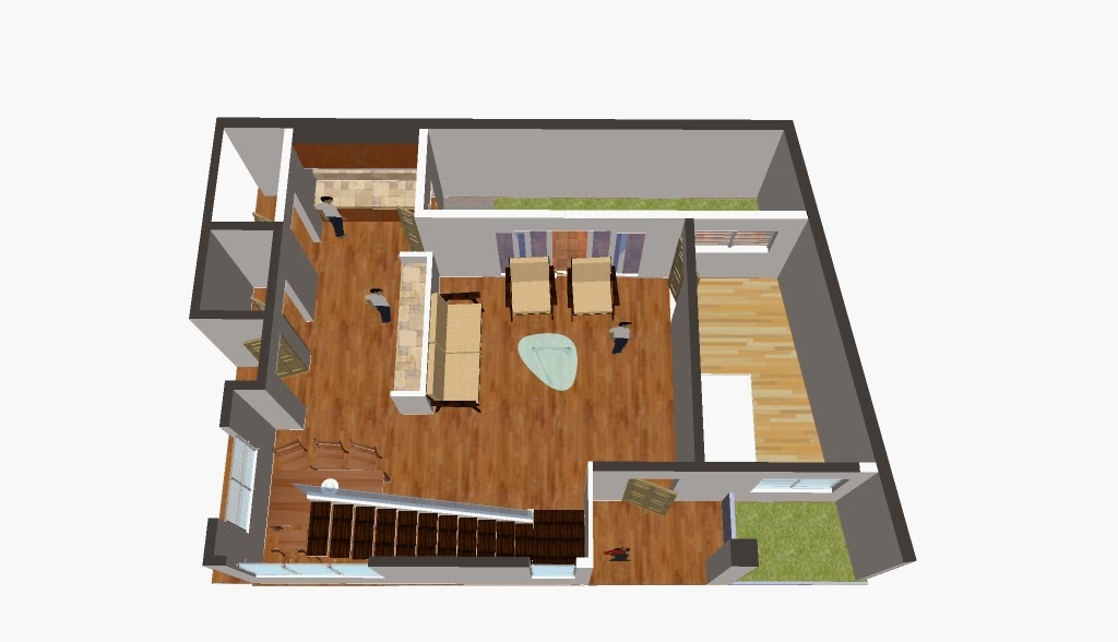


ground floor


2nd floor

*****************

Hope you enjoyed this post.
Later, guys!
 :)


For design inquiries, consultations, projects, collaborations, and whatnot,
please feel free to email atelierdeaurora@gmail.com
Click here for list of services.
**This project is in collaboration with Think Factory DS**

Friday, June 21, 2013

This is not a fashion blog.

No clothes. No OOTD's. Weird Title. Why.

Okay, how do I say this without boring you?  :))

This is not a fashion blog. Or atleast not just. When I put up this blog up as a fresh grad I made it clear to myself that I was running a design and fashion blog. It's not just a personal style archive but also a blog about multidisciplinary design, the areas of design that I'm particularly interested in. Infact, some of my earlier posts seriously reflected this. Like this and this. It was almost boring for those who are here for a light read and pretty pictures. I lost track months after graduation. Having broken away from 5years of bitter-sweet architorture and getting to wear something other than a uniform and run Blind Clothing, slowly gaining wonderful like-minded friends and a couple of supportive readers, I found sudden freedom in doing what I've always liked as a kid, and I just ran around the fashion circle like a mad man. In heels.

After having sworn to the architecture profession  last march, the conviction slowly (but harshly) started setting in and I've been feeling a hunger to use my 5-year education to do more. To give more. To be more.

This blog should be, more than anything, a reflection of that. I've been doubtful that I'd lose readers and interaction when I stay true to this blog's nature, especially when the writing gets lengthy like this one. Design is, face it, not as "relatable" as fashion. But then I thought, what good is a blog if I can't speak my own mind through it, right? :) 


So this is what I've been up to lately. Being a 3month-old architect, I've trying to set up my own private practice and thinking day and night about-- how to do that exactly; the name of my office, the design principles it should stand by, the things I should advocate for, how to gain momentum, the means to make it work etc.. that alongside listening to audio-books about financial management and e-books about professional practice. It is overwhelming and frightening. but it's also just as exciting. and nerve-racking. Those above are some of my works on product development, furniture contracts for a client.

Some of my favorites from our shipments.
(Not my design)

 Same framing system,  played up with a variety of weaving patterns made to compliment the cafe its intended for :)
(Not my design)

While trying to initiate my private practice and scout out projects I thought it would be wise to accept this gracious offer, this blessing, and do furniture design and product development.. to learn international standard, educate my taste, learn more about materials. After all, I am hoping to specialize in residential and hospitality design someday. By hospitality I mean hotel, resort, spa, retail, restaurants, bars and cafes. :)

So this is me now, what I do, and what my blog is all about. What do you think? Please say I'm not a hopeless case. :)) Do you know of any other design blogs out there? Hook me up! :)


x
Dawn


*** All photos of the pieces in this post are no longger my/our intellectual property but for the client  we work for ***

Sunday, September 18, 2011

PUTTING HEART INTO THE ART: A Rights Based Barrier Free Community

Last July, I got an email from Lantawan Magazine's editor- in-chief, Archt. Bela Lanyi, SVD telling me that University Of San Carlos' Department of Languages is asking if they can publish an article I wrote 2 years ago (with Eugene yaoto) in an English text book. I said no.  KIDDING. WHAT AM I CRAZY? :)) Of course I said yes, I was so happy I ran straight to my parents room to proclaim the good news. Haha. I'm honored and hyped that a lot more students will get to read this article that I poured my soul into. Thank You, Lord. :) 


This article is about Designing for Persons with disabilities.  So here I am, sharing it with all of you. Some may find it candid, some naive, some just plain idealistic. But here's a piece of my heart that goes out to our  brothers and sisters who are physically deprived :)

(Thanks to Sam Despi, our beautiful layout artist, for sending me a copy of this article again. haha. You the best Sammie! :D )

---------------------------------------------------------------------------------------------------

2010 Cover


Like a paper tiger, the bahay kubo bravely folds out of the void, as if to challenge the sterotypes of native Filipino aesthetic as one of "horror vacui" or fear of empty spaces. In fact, its utter simplicity has more in common with Zen or modernist design, proof once again that distaste for clutter knows no borders.


Putting Heart into the Art
An advocacy for a Rights Based Barrier Free Community for Persons with Disabilities
By: Kathrynn Dawn Sy and Eugene Laurence Yaoto

Imagine traveling the world in alacrity, boldly breaking borders and discovering fresh ideas, reaching dreams and enjoying undisclosed havens. You’re just thrilled and thriving.

Then suddenly, you glance through a mirror, see a missing arm, discover an immobile pair of legs, a hearing aid,even ablurry reflection.The idea hits you—it’s not as easy as it seems.

Our ancestors found ways to reach far-flung places by building bridges, be it in the form of land bridges or boats. They discovered faster means of mobility shortly after.  But somewhere between the past and the present, along the highway towards urbanism and development, access became a problem. Ironically.

July ___,  2009. To our surprise, design class was cancelled. We heard it over the speakers.We had to be at the CAFA theatre to attend a talk about “People-Friendly Environments for an Inclusive Rights-Based Barrier Free Community for Persons with Disabilities(PWD).” Half curious and half skeptical, we went inside to check what it was about  with, frankly, an intention to make our exit and carry on with our design plate twenty minutes after.

We went inside and saw a slide onscreen but no one onstage. We scanned the place for a new face, a prospective speaker, and we beheld an intelligent and kind-looking woman in a wheelchair. She was Ms. Adela Kono, Vice-Chair of the Accessibility Monitoring Committee. Having spent half of her lifetime in a wheel chair, she’s an active accessibility specialist who believes in the worldwide disability movement’s motto:“Nothing about us without us.” To make the long story short, our skepticism, which continued on through halfway of her presentation,was slowly replaced by a burden. We found ourselves hanging on to the lady’s every word and every slide. Yes, we finished her presentation.

Building communities is a great honor bestowed on creators such as architects, engineers, and designers. Along with this is a sense of accountability for the safety and well-being of the inhabitants of our built environment, safety most especially for those who are already physically deprived.

Having been introduced to Batasang Pambansa 344 or the “Accessibility Law”  in our Professional Practice class, we were already aware of disabled persons’ needs and demands in so far as the practice of architecture is concerned.However, it wasn’t until that afternoon that we came to know how pressing and necessary it is to strictly yield to these demands and shed off little compromises as designers. We didn’t realize how strenuous and dangerous these small compromises are for PWDs until we actually heard it from them, elaborated and demonstrated down to the details.

 We have noticed that a lot of times, when designing structures with very limited areas, architects tend to shorten PWD entrance ramps, increasing the slope andmaking it difficult to access, lessen the toilet space, and forget about all the short access ramps that take PWDs from one storey/elevation/space to another.  Perhaps the reason that owners are hesitant to yield to these needs is that it takes a good deal of marketable space. Space, after all, is money.  Plus, it is not very aesthetically enhancing. But what is form, or in this case economics, without functionality?

To be honest, their needs are nothing too expensive, nothing hi-tech, nothing rocket-science. Their needs, however, still demand a lot of space and close attention for logistics: foot space, positioning of grab bars, distances and clearances to the .05m, height of switches and outlets, furniture and fixtures, parking spaces. It’s all just a matter of human rights, of putting heart into the art.

How can we think of comfort for usual people and not think of comfort for those who need it more? We truly need humane designers who will pay attention to the PWD’s most pressing needs and give some empathy in the service we call architecture, a call for relearning, an appeal for concerned professionals to put their knowledge in application.

Buildings are made for people, not the other way around.

That’s basic. Well, supposedly.

If designers were more humanitarian, more sensitive to the needs of others, then organizations such as the United Nations Convention on the Rights of Persons with Disabilities need not exist.

Disability is not a deficiency. It is a consequence. “It results from the interaction between persons with impairments and attitudinal and environmental barriers that hinder their full and effective participation in society on an equal basis with others” (UNCRPD).

So you think your building is PWD-friendly? Below is a checklist, ten ways of checking if your building is barrier-free and universally accessible. Go over it. Pin it to your cork board. Attach it to your organizers. Whatever it takes. 

Be honest! 

(Checklist attached here, To see the chart checklist, get yourself a copy of the Lantawan Magazine 2010 back issue! :D )

----------------------------------------------------------------------

Thanks again, Bro Bela for allowing me to write, Eugene for encouraging me to join, And Mrs Kono, our resource person.


To everyone from CAFA, you'd be amused to know that this article was cooked at the ACC (archtitecture computer center) one hectic deadline afternoon when the ACC was full! You know what that's like!:)) ) 

Meanwhile, This year's theme is "Nation Building" and I still haven't thought of a topic due one month ago. My brain cells are dead, I think it misses school. Oh no.

Later. :)

Wednesday, June 1, 2011

Beyond Seduction: The Pursuit on Finding the Legacy of our Time


I submitted an article for Lantawan Magazine & Bro. Bela (editor in chief) urged me to publish it anonymously thinking it might be too offensive. I agreed, just because it sounded cool (woaaah anonymous!).Looking back, maybe I should've gotten a pen name! (oooh that would have been spicy! haha). Im publishing it here, just because I can. Just because I want to put a face behind my article. Just because, Im no longger a student.( \m/)


Here it goes:
-----------------------------------------------------------------------------------------
"When faced with a problem, we don't only think of a solution. We use the problem to come up with an even better design."-- This is what my Design 3 adviser told me when I consulted him about my parking building dilemma three years, eighteen plates, one esquisse, and one thesis ago. (whew)

It would be much later that I saw exactly what he meant. A lot of the greatest breakthroughs in architecture came  forth as a result of a pressing need. Gothic era's quadripartite vault transpired from the barrel vault because there was a problem of structural support, and so did buttresses. Brunelleschi's strutted, double- shelled dome was invented as a substitute to the conventional drum to serve as a deterrent to construction difficulties.Geometry was discovered as a basis for planning in the renaissance and would later make plans more functional, beautiful, proportional, interesting. Joseph Paxton's luminous, light, airy crystal palace ignited the era of pre-fabrication as a means of faster, and lighter construction through iron and glass. All these were design solutions that turned out to be architectural trends, catching on fast like lemonade sold on a hot day. The architects behind these innovations exceeded the expectations of their time- revolutionary!


Crystal Palace, ignited the industrial revolution

Brunelleschi's dome


In the long and rich history of architecture, every era, every period, every decade leaves an invaluable inheritance to the next. A lot of architectural principles during the Renaissance can be traced through subsequent architectural movements- from Mannerism, to Baroque, or Rococo, to Neo- Classicism, to Eclecticism, to Modernism, and to Postmodernism. The influence of Renaissance architecture can still be seen in many of the modern styles and rules of architecture today. The same goes with the Gothic era, the early Christian period, the Baroque, etc.

Now what's with "Parametric Design", "Smooth Architecture" and "digitally driven design" being dubbed as "the legacy of our time" ? I applaud the innovation behind this creative form- finding method. Aesthetics-wise, interesting. But what about climate? Won't those giant fish bowls increase heat gain inside buildings? And economy? Aren't we supposed to promote locally abundant and sustainable materials? The Philippines is a third- world country. Our needs are different. Our Social Issues are different. Therefore, the    direction we must take must also be different. We can blame it on the internet and the many pictures of buildings that scream "copy me!" or we can blame it on us for wanting to be something we're not.

In one of our school's forums, A schoolmate once asked an international, Filipino, parametric design expert about the advantages of this innovation. I was heart-broken when the expert said:"Since your forms are unique, you get to attract more clients, and more clients mean more projects" True, but we should know better than luring our clients. We're suppose to educate them. The notion of the parametric and the potential network practices may need to incorporate more digital techniques in order to step-up to the challenge of the future while building on the recent past. If it isn't for that, then it's nothing but seduction.

If I may quote from Niccolai Ouroussoff: " The greatest influence of this trend, however, may be on a younger generation of architects. Reared in an era where there seems to be an irresistible supply of work, these architects often seem eager to build at any cost. And their facility with computer software can make it easy to churn out seductive designs without digging deeply into social truths."

Personally, this type of architecture is a legacy for legacy's sake alone: egocentric, proud and shallow. It is true that " Open-mindedness doesn't necessarily cause you to lose origin or culture". But culture or origin is not the concern of what seems to be "close-minded" people like me. Rather, it is purpose. 

Wasn't architecture created primarily to provide for users' needs without jeopardizing the environment and the generations after us? Wasn't this what differentiated architecture from all other forms of art? Now tell me, what part of "service" does this twisting and tapering belong to? We are building habitats, not action figures. If we are brilliant enough to even think of leaving a legacy to the world, then, aside from the search of beauty, let's think of ways to increase the competence of our structures, not waste our time trying to make them look like ships, aircrafts, toys, or a scene from the Jetsons! The possibilities are endless: faster or easier construction, energy-saving features, cheaper resources, more functional building systems. The list is long.

Alessandro N. Tombazis, a noble Greek architect, said: "Architects by definition have to have a higher degree of egoism, otherwise they would not be creators. Within this vanity however, humility should be one of the guiding forces, otherwise we cannot serve, we cannot create understanding that what is around us is more important than our own selves."

What we need is a more meaningful legacy to leave the next generation with, especially at this age where change is most crucial. I want my generation of designers and builders to design for a reason, for a bigger purpose other than ego and aesthetics. I want us to humbly build in order to improve quality of life here on earth, that in its most beautiful form.


:)
------------------------------------------------------------------
On a much lighter note, I miss CAFA. sort of. These are photos from three years ago. :) 


By the way, some time after thesis defense, Bro. Bela said he regretted making it anonymous :))
Oh serious stuff. haha.